Role
User Research
Product Strategy
UI Design
Interaction Design
Usability Testing
Tools
Figjam
Notion
Maze
Figma
Dovetail
Timeline
5 weeks
The Problem
Currently, the MyPlace Platform does not allow users to create their own groups. The absence of authorization and features result in low rates of home sharing.
The Solution
A smooth group creation experience was offered by empowering users with authorization for group management. Thus, users have become capable of creating their own groups with customizable privacy settings.
Usability Review
To help better understand the product, I conducted a usability review to identify pain points and wow moments in the existing experience.
Business & User Frustrations
Following a usability review, I defined the primary and secondary business and user frustrations.
Primary Frustration
When users attempt to create their own groups, they are restricted to take action which, in return, results in low rates of home sharings.
Secondary Frustration
When users want to customize their privacy settings, they face with authorization issues, which results in lack of commitment to the app.
Competitor Benchmarking
After completing the usability review, I crossed to competitor benchmarking that helped me identify the standards in other platforms. This, in return, was used to design a better experience.
Problem Space
Combining usability review and competitor benchmarking helped me clarify the problem space to begin the user interview.
"How Might We provide a smooth group creation experience?"
User Interviews
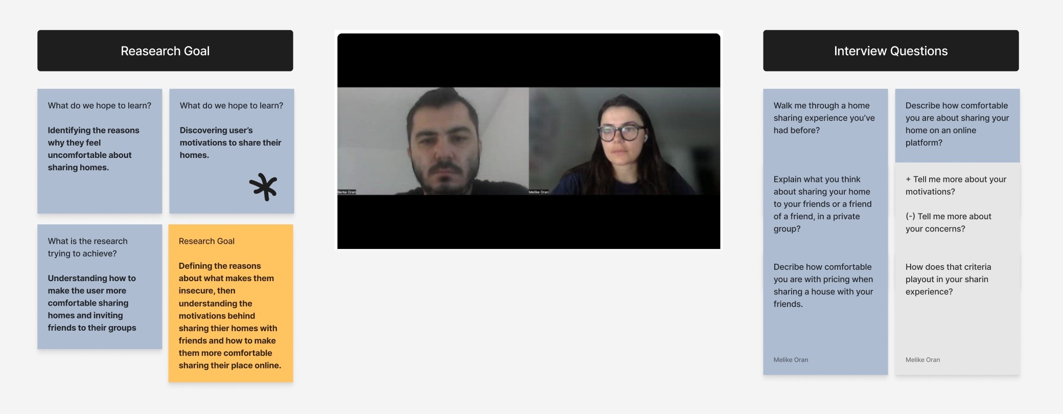
Next step was coming up with a research plan and conducting a user interview. For the plan, I outlined the expectations and the research goal, in addition to creating a set of questions to investigate user needs and frustrations.
Affinity Map
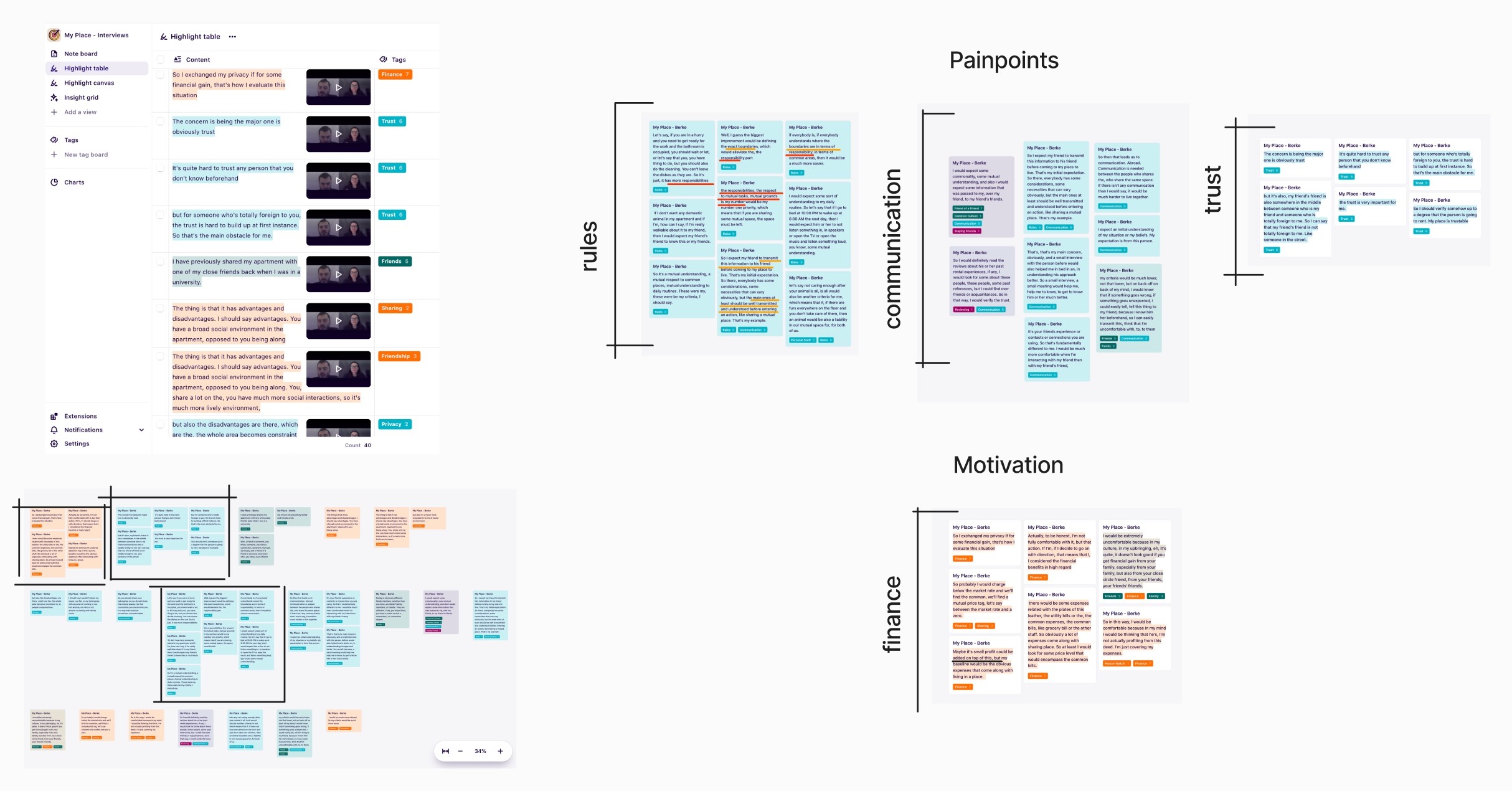
To validate the initial observations gathered from usability review and competitor benchmarking, I processed the interview results on Dovetail by using a taxonomy of tags. That helped me in identifying the problems clearly.
The primary insight that emerged from the interview was the need for prioritization of 'rules'. In order for users to feel more secure, it would be beneficial to offer customizable privacy settings.
Information Architecture
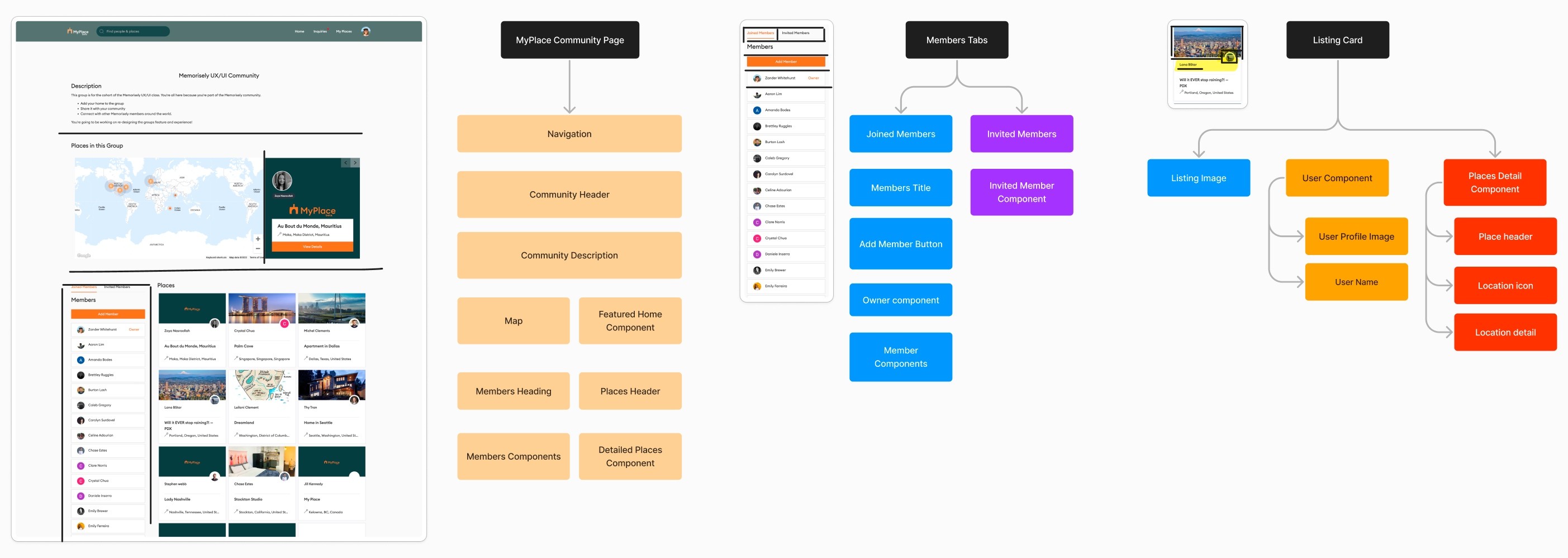
After the affinity map, I mapped out the existing information architecture diagram. The IA of the MyPlace Platform helped me to understand the current content structure and how it could be improved.
Ideation
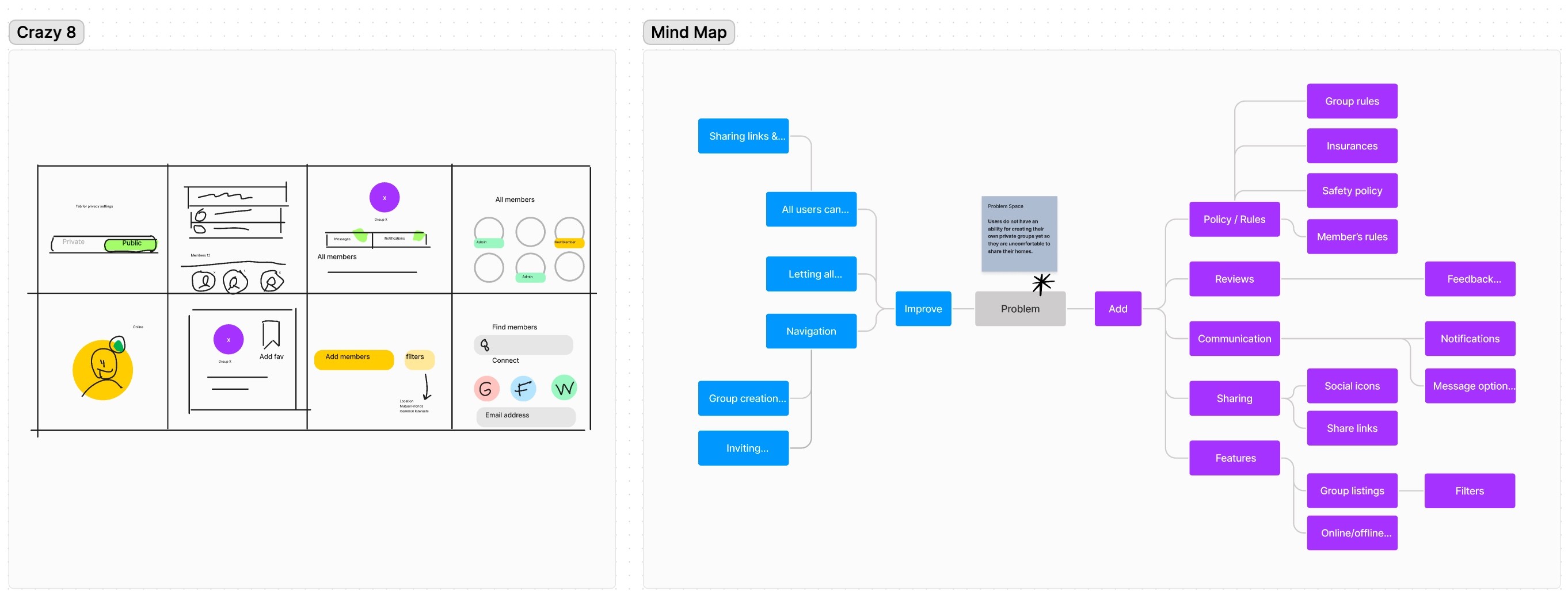
I performed a series of ideation techniques such as Crazy 8 and Mind Mapping. This allowed me to generate ideas that helped me pivot from the problem to the prototype.
What can we add?
The highest priority addition was authorizing MyPlace members in group creation.
What can we improve?
The highest priority improvement was offering customizable privacy rules.
User Flows
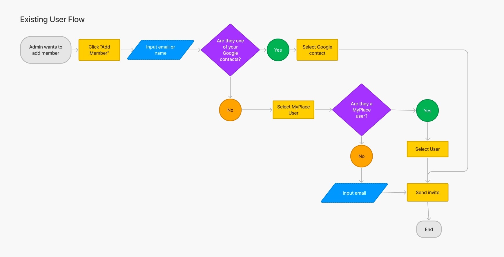
Following the ideation, I created 2 user flow paths. The first one displays the existing flow. The second one, on the other hand, offers an improved version based on new ideas.
Rapid Prototyping
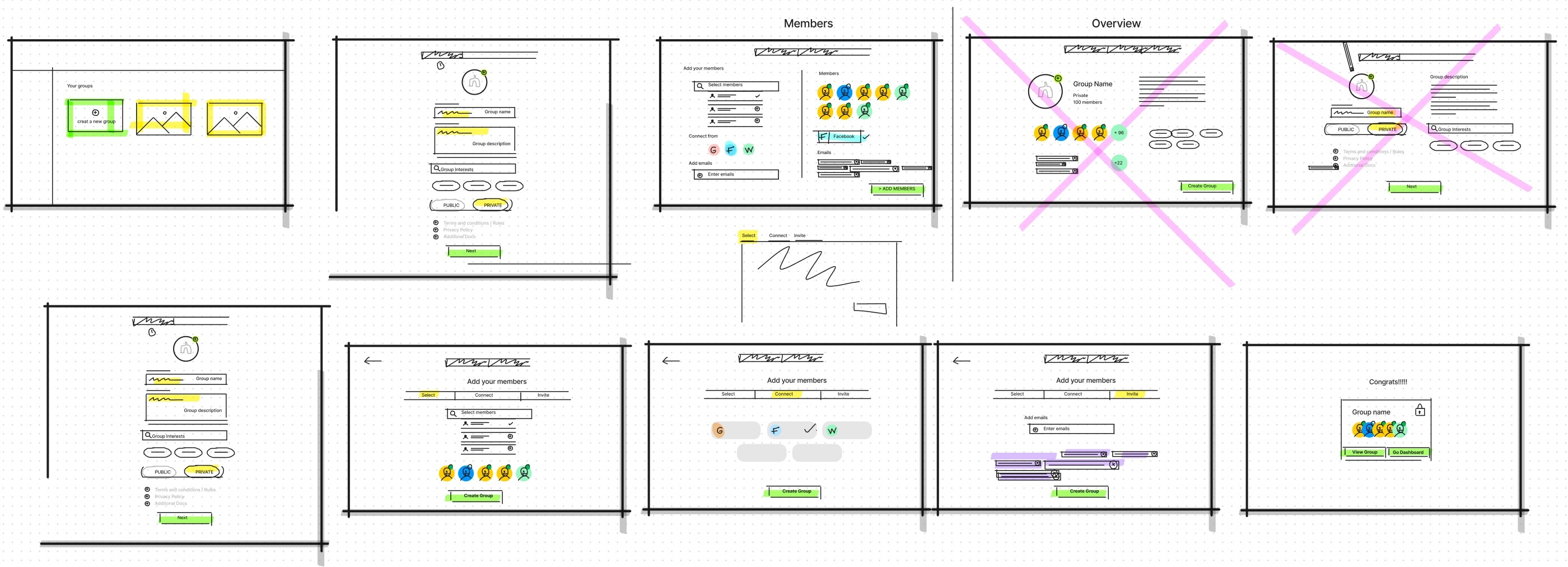
After mapping out an improved user flow, I started rapid prototyping. The sketching allowed me to iterate the original idea and visualize it without committing the final version too much.
High Fidelity Prototype
Below is the final version of the prototype that I created. I included interactions and transitions from Figma to match the product's flow.
Usability Test and Outcomes
Coming Soon!


