Role
User Research
Product Strategy
UI Design
Interaction Design
Usability Testing
Tools
Figjam
Notion
Maze
Figma
Otter
Timeline
5 weeks
The Problem
When users try to start their challenge for the first time, they face with a lot of screens that involve overwhelming texts and unclear settings. These are confusing and frustrating which result in abandonment of the app.
The Solution
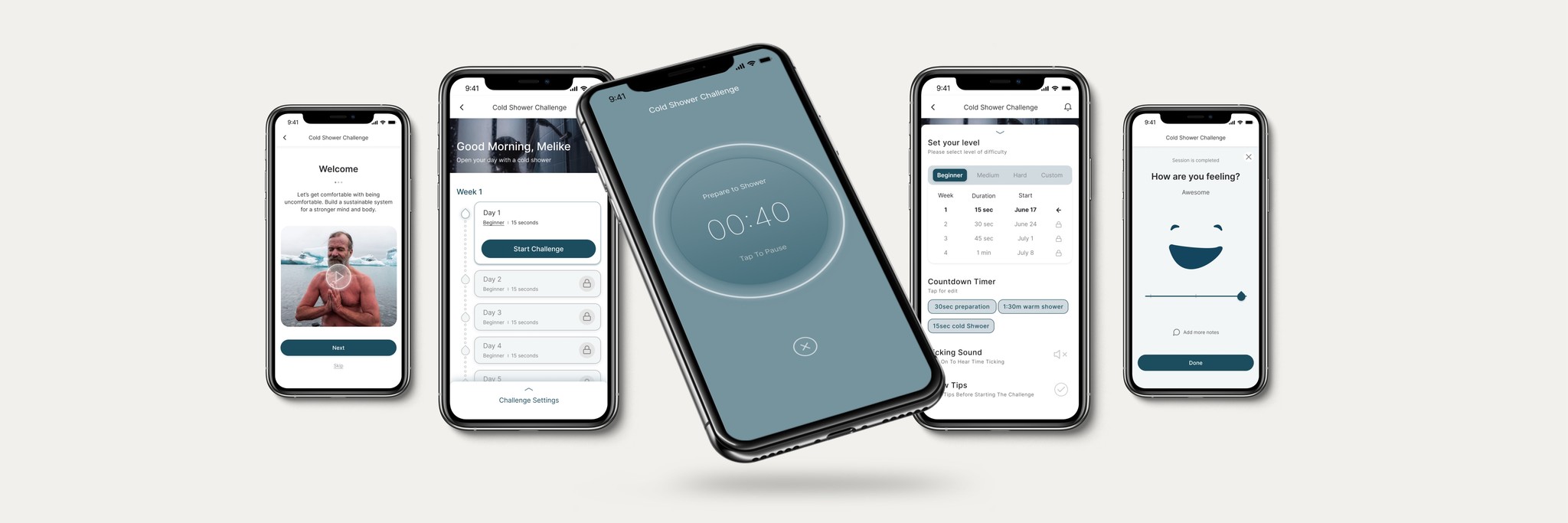
From the onboarding to the final stage, the shower challenge was simplified by offering easy-to-navigate steps to help and motivate users through the flow. Thus, their engagement with the app is projected to increase, as well as the conversion rates from the free plan to premium membership.

Usability Review
To help us better understand the product, we conducted a usability review to identify pain points and wow moments in the existing experience.
Business & User Frustrations
Following a usability review, we defined the primary and secondary business and user frustrations.
Primary Frustration
Secondary Frustration
Competitor Benchmarking
After completing the usability review, we moved on to the competitor benchmarking to help us identify the standards in competitor products. This, in return, was used to improve the existing experience.
Problem Space
Combining our usability review and competitor benchmarking helped us define the problem space where we asked:
"How Might We simplify the steps, so that new users can take advantage of the cold shower challenge?"
Ideation
We conducted a series of ideation techniques such as Crazy 8 and Mind Mapping. This allowed us to consider an array of solutions. Following ideation, we mapped out what could be improved or added to the product.
What can we improve?
What can we add?
User Flows
Following the ideation, we created 2 user flow paths. The first one displays the existing flow. The second one, on the other hand, offers an improved version based on new ideas.
Rapid Prototyping
After mapping out an improved user flow, we crossed to the rapid prototyped solution phase. The sketching allowed us to iterate the original idea and visualize it without committing the final version too much.

Styles & Components
Before creating the hi-fidelity prototype, we defined the product styles and interactive components in Figma to help us design consistently.

High Fidelity Prototype
Below is the final version of the prototype that we created. We included interactions and transitions from Figma to match the product's flow.
Usability Testing
After the creation of the prototype, we wrote a testing script with scenarios and tasks to validate the product with real users. We used Maze to gather feedback.
Key Learnings
• Motivating users helps them to complete the tasks, even if they are unpleasant.
• Creating additional steps breaks the flow and risks the abandonment of the app.
• Short explanations for each tasks provide effective guidance.


